Bootstrap可伸缩的菜单边栏的实现方法
两款侧边栏菜单控制实现方式方式,自行选择.
#Option 1 伸缩式
点击左侧菜单图标会展出/缩回菜单栏,该样式适合于PC站,演示地址

HTML
<link href="//netdna.bootstrapcdn.com/bootstrap/3.0.3/css/bootstrap.min.css" rel="stylesheet" id="bootstrap-css">
<script src="//netdna.bootstrapcdn.com/bootstrap/3.0.3/js/bootstrap.min.js"></script>
<script src="//code.jquery.com/jquery-1.11.1.min.js"></script>
<!------ Include the above in your HEAD tag ---------->

<div id="wrapper" class="active">

      <!-- Sidebar -->
            <!-- Sidebar -->
      <div id="sidebar-wrapper">
      <ul id="sidebar_menu" class="sidebar-nav">
           <li class="sidebar-brand"><a id="menu-toggle" href="#">Menu<span id="main_icon" class="glyphicon glyphicon-align-justify"></span></a></li>
      </ul>
        <ul class="sidebar-nav" id="sidebar">
          <li><a>Link1<span class="sub_icon glyphicon glyphicon-link"></span></a></li>
          <li><a>link2<span class="sub_icon glyphicon glyphicon-link"></span></a></li>
        </ul>
      </div>

      <!-- Page content -->
      <div id="page-content-wrapper">
        <!-- Keep all page content within the page-content inset div! -->
        <div class="page-content inset">
          <div class="row">
              <div class="col-md-12">
              <p class="well lead">An Experiment using the sidebar template from startbootstrap.com which I integrated in my website (<a href="http://animeshmanglik.name">animeshmanglik.name</a>)</p>
              <p class="well lead">Click on the Menu to Toggle Sidebar . Hope you enjoy it!</p>
            </div>
          </div>
        </div>
      </div>

    </div>
CSS
.row{
    margin-left:0px;
    margin-right:0px;
}

#wrapper {
    padding-left: 70px;
    transition: all .4s ease 0s;
    height: 100%
}

#sidebar-wrapper {
    margin-left: -150px;
    left: 70px;
    width: 150px;
    background: #222;
    position: fixed;
    height: 100%;
    z-index: 10000;
    transition: all .4s ease 0s;
}

.sidebar-nav {
    display: block;
    float: left;
    width: 150px;
    list-style: none;
    margin: 0;
    padding: 0;
}
#page-content-wrapper {
    padding-left: 0;
    margin-left: 0;
    width: 100%;
    height: auto;
}
#wrapper.active {
    padding-left: 150px;
}
#wrapper.active #sidebar-wrapper {
    left: 150px;
}

#page-content-wrapper {
  width: 100%;
}

#sidebar_menu li a, .sidebar-nav li a {
    color: #999;
    display: block;
    float: left;
    text-decoration: none;
    width: 150px;
    background: #252525;
    border-top: 1px solid #373737;
    border-bottom: 1px solid #1A1A1A;
    -webkit-transition: background .5s;
    -moz-transition: background .5s;
    -o-transition: background .5s;
    -ms-transition: background .5s;
    transition: background .5s;
}
.sidebar_name {
    padding-top: 25px;
    color: #fff;
    opacity: .7;
}

.sidebar-nav li {
  line-height: 40px;
  text-indent: 20px;
}

.sidebar-nav li a {
  color: #999999;
  display: block;
  text-decoration: none;
}

.sidebar-nav li a:hover {
  color: #fff;
  background: rgba(255,255,255,0.2);
  text-decoration: none;
}

.sidebar-nav li a:active,
.sidebar-nav li a:focus {
  text-decoration: none;
}

.sidebar-nav > .sidebar-brand {
  height: 65px;
  line-height: 60px;
  font-size: 18px;
}

.sidebar-nav > .sidebar-brand a {
  color: #999999;
}

.sidebar-nav > .sidebar-brand a:hover {
  color: #fff;
  background: none;
}

#main_icon
{
    float:right;
   padding-right: 65px;
   padding-top:20px;
}
.sub_icon
{
    float:right;
   padding-right: 65px;
   padding-top:10px;
}
.content-header {
  height: 65px;
  line-height: 65px;
}

.content-header h1 {
  margin: 0;
  margin-left: 20px;
  line-height: 65px;
  display: inline-block;
}

@media (max-width:767px) {
    #wrapper {
    padding-left: 70px;
    transition: all .4s ease 0s;
}
#sidebar-wrapper {
    left: 70px;
}
#wrapper.active {
    padding-left: 150px;
}
#wrapper.active #sidebar-wrapper {
    left: 150px;
    width: 150px;
    transition: all .4s ease 0s;
}
}
JS
$("#menu-toggle").click(function(e) {
e.preventDefault();
$("#wrapper").toggleClass("active");
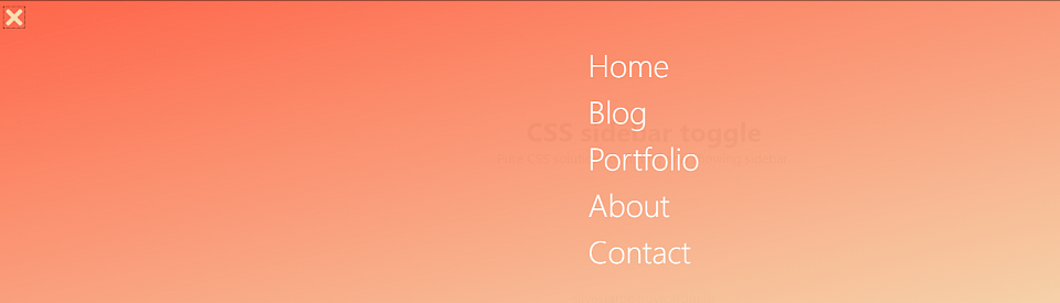
});#Option 2 覆盖式
该样式通过点击指定菜单按钮弹出一个全屏的菜单层覆盖掉原始页面,适用于移动站,演示地址
HTML
<div class="wrapper">
  <input type="checkbox" id="menuToggler" class="input-toggler" value="1" autofocus="true"/>
  <label for="menuToggler" id="menuTogglerLabel" class="menu-toggler" role="button" aria-pressed="false" aria-expanded="false" aria-label="Navigation button">
    <span class="menu-toggler__line"></span>
    <span class="menu-toggler__line"></span>
    <span class="menu-toggler__line"></span>
  </label>
  <nav id="sidebar" class="sidebar" role="navigation" aria-labelledby="menuTogglerLabel" aria-hidden="true">
    <ul id="menubar" class="menu" role="menubar" aria-orientation="vertical">
      <li class="menu__item" role"none"><a class="menu__link" href="#" role="menuitem" tabindex="-1">Home</a></li>
      <li class="menu__item" role"none"><a class="menu__link" href="#" role="menuitem" tabindex="-1">Blog</a></li>
      <li class="menu__item" role"none"><a class="menu__link" href="#" role="menuitem" tabindex="-1">Portfolio</a></li>
      <li class="menu__item" role"none"><a class="menu__link" href="#" role="menuitem" tabindex="-1">About</a></li>
      <li class="menu__item" role"none"><a class="menu__link" href="#" role="menuitem" tabindex="-1">Contact</a></li>
    </ul>
  </nav>
  <main class="content">
    <h1>CSS sidebar toggle</h1>
    <p>Pure CSS solution for hiding and showing sidebar.</p>
  </main>
</div>
<a class="sb-link" href="//silvestarbistrovic.from.hr/en/articles/css-sidebar-toggle/">silvestarbistrovic.from.hr</a>
CSS
@mixin fluid-type($properties, $min-vw, $max-vw, $min-value, $max-value) {
    @each $property in $properties {
        #{$property}: $min-value;
    }

    @media screen and (min-width: $min-vw) {
        @each $property in $properties {
            #{$property}: calc(#{$min-value} + #{strip-unit($max-value - $min-value)} * (100vw - #{$min-vw}) / #{strip-unit($max-vw - $min-vw)});
        }
    }

    @media screen and (min-width: $max-vw) {
        @each $property in $properties {
            #{$property}: $max-value;
        }
    }
}

@function strip-unit($value) {
    @return $value / ($value * 0 + 1);
}

@function em($pixels, $context: $default-font-size) {
    @return #{$pixels/$context}em;
}

// variables
:root {
  --sidebar-width: 100%;
  --toggler-size: 30px;
  --toggler-line-number: 3;
  --toggler-line-size: calc(var(--toggler-size) / (var(--toggler-line-number) + var(--toggler-line-number) - 1));
  --toggler-offset-left: 10px;
  --toggler-offset-top: 10px;
  --toggler-color: Tomato;
  --toggler-color-hover: Wheat;
}

// same as var(--toggler-line-number)
$total: 3;

// reset
* {
  padding: 0;
  margin: 0;
  box-sizing: border-box;
}

// styling
html {
  font-family: -apple-system, BlinkMacSystemFont,
"Segoe UI", "Roboto", "Oxygen",
"Ubuntu", "Cantarell", "Fira Sans",
"Droid Sans", "Helvetica Neue", sans-serif;
  @include fluid-type(font-size, 20em, 75em, .8rem, 1.2rem);
}

.wrapper {
  min-width: 100vw;
  background: AliceBlue;
  display: flex;
}

.sidebar,
.content {
  transition: all .25s ease-out;
}

.sidebar {
  width: var(--sidebar-width);
  transform: translateX(calc(var(--sidebar-width) * -1));
  background: linear-gradient(to bottom right, Tomato, Wheat);
  display: flex;
  justify-content: center;
  align-items: center;
  position: absolute;
  top: 0;
  height: 100vh;
  opacity: .5;
}

.content {
  width: 100%;
  display: flex;
  align-items: center;
  justify-content: center;
  flex-direction: column;
}

.menu {
  list-style-type: none;
}

.menu__link {
  color: white;
  font-weight: 100;
  text-decoration: none;
  font-size: 10vmin;
  line-height: 15vmin;
  transition: all .25s ease-out;

  &:hover,
  &:focus,
  &:active {
    color: Gold;
  }
}

.menu-toggler {
  border-radius: calc(var(--toggler-line-size) / 2);
  display: block;
  width: var(--toggler-size);
  height: var(--toggler-size);
  position: fixed;
  top: var(--toggler-offset-top);
  left: var(--toggler-offset-left);
  cursor: pointer;
  z-index: 1;
}

.menu-toggler__line {
  height: var(--toggler-line-size);
  background: var(--toggler-color);
  position: absolute;
  border-radius: calc(var(--toggler-line-size) / 2);
  left: 0;
  right: 0;
  transition: all .25s ease-out;

  $num: 1;

  @while $num <= $total {
    &:nth-child(#{$num}) {
      top: calc(var(--toggler-line-size) * #{$num} + (var(--toggler-line-size) * (#{$num} - 2)));
    }

    $num: $num + 1;
  }
}

.input-toggler {
  position: absolute;
  left: -100%;

  &:focus ~ .menu-toggler {
    outline: 1px dotted;
  }

  &:checked ~ .menu-toggler {
    .menu-toggler__line:not(:first-child):not(:last-child) {
      opacity: 0;
    }

    .menu-toggler__line:first-child,
    .menu-toggler__line:last-child {
      background-color: var(--toggler-color-hover);
    }

    .menu-toggler__line:first-child {
      transform: translateY(calc(var(--toggler-line-size) * (var(--toggler-line-number) - 1))) rotate(45deg);
    }

    .menu-toggler__line:last-child {
      transform: translateY(calc(-1 * var(--toggler-line-size) * (var(--toggler-line-number) - 1))) rotate(-45deg);
    }
  }

  &:checked ~ .sidebar {
    transform: translateX(0);
    opacity: .98;
  }
}

// sig
.wrapper {
  height: calc(100vh - 50px);
}

.sb-link {
  display: flex;
  height: 50px;
  align-content: center;
  align-items: center;
  justify-content: center;
  text-decoration: none;
  color: #bb5555;
  transition: background .3s;
}

.sb-link:hover,
.sb-link:focus,
.sb-link:active {
  background: #f7f7f7;
}
JS
let menuToggler = document.getElementById('menuToggler')
let menuTogglerLabel = document.getElementById('menuTogglerLabel');
let sidebar = document.getElementById('sidebar');
let menuItems = document.getElementsByClassName('menu__link');

menuToggler.addEventListener('change', function() {
  if(menuToggler.checked) {
    menuTogglerLabel.setAttribute('aria-pressed', 'true');
    sidebar.setAttribute('aria-hidden', 'false');
  } else {
    menuTogglerLabel.setAttribute('aria-pressed', 'false');
    sidebar.setAttribute('aria-hidden', 'true');
  }

  for(let menuItem of menuItems) {
    if(menuToggler.checked) {
      menuItem.setAttribute('tabindex', '0');
    } else {
      menuItem.setAttribute('tabindex', '-1');
    }
  }
});
相关资源: